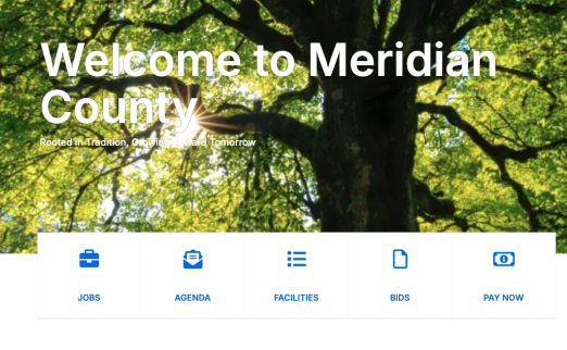
Cards can be configured to display your content in a variety of ways. See the options below.
Card 4

Card Image Circle 1
Card Image Circle 1 body text

Card Image Circle 2
Card Image Circle 2 body text.

Card Image Circle 3
Card Image Circle 3 body text.

Card Image Left
This a Card Image Left with the image on the left and the text on the right

Card Image Left 2
This a Card Image Left 2 body text

Card Image Right 1
Text for Card Image Right 1.

Card Image Right 2
Text for Card Image Right 2
Card Basic 1
Card Basic 1
Card Basic 2
Card Basic 3
Included Fields and Options:
- Title (Optional)
- Body (Optional)
- Media Image (Optional)
- Links (Optional)
- URL
- Link text
- Select a target (Dropdown)
- None
- Current window
- New window
- Parent window
- Topmost window
- Icon Class
- Select a style (Dropdown)
- None
- Default button
- Primary button
- Secondary button
- Header (Optional)
- Display (Dropdown: Optional) (This list of card displays is configurable per project)
- Default
- Card Tall
- Image Background
- Image Circle
- Image Left
- Image Right
- Basic
- Basic Plus


